
Rebel.com
A brand built around the moment
a domain comes to life.


What I did.
Led the strategic reset of the Rebel brand. Diagnosed the market reality, identified the brand’s point of differentiation in a saturated registrar category, and developed the positioning and creative platform built around the dot. Guided the work from strategy through brand concept, ensuring the idea translated into a clear system the company could use across product, marketing, and customer experience.
-
Defined the strategic idea behind the rebrand. Positioned the dot as the central organizing concept rooted in how domains work and the moment an idea becomes real online.
-
Creating clear, pithy positioning and focused messaging frameworks,.
-
Developed the core creative direction that brought the dot to life as both symbol and system. Ensured the idea connected meaningfully to Rebel’s product and customer moment.
-
Worked with the design team to translate the concept into a scalable visual system. The dot became the anchor for layouts, motion, framing, and interaction across the brand.
-
Partnered with product, marketing, and leadership to ensure the brand system worked across the website, product surfaces, and customer experience, not just marketing materials.
The problem
The Rebel brand had become fragmented, dated, and disconnected from the product it existed to represent. It needed a clearer idea and a more modern expression that could reconnect the brand to the moment of creating a domain and bring a sense of contemporary technology and relevance back into the experience.


The approach
The approach was to anchor the brand in a single, clear idea rooted in the product itself. By using the dot at the center of Rebel.com as the organizing concept, we built a modern brand system that connected the act of registering a domain to the structure of the internet and translated that idea into a simple, scalable design language.
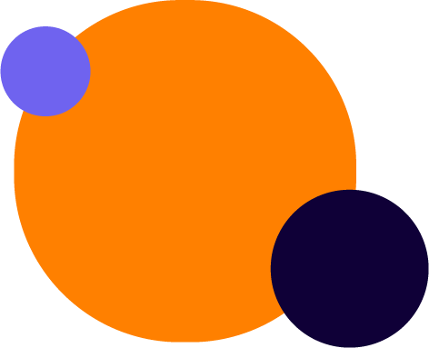
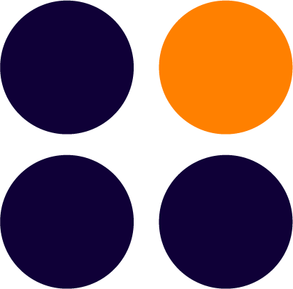
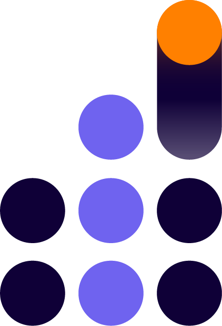
The ‘dot’ design system.
The design system built on the idea of the dot as the moment an idea becomes real online. In a domain name, the dot sits at the center, connecting the name to the wider internet. That structure became the organizing principle of the brand.
Visually, the dot acted as the focal point across the system. It anchored layouts, guided motion, and marked key moments across the experience. Conceptually, it represented the role Rebel plays for its customers: the point where an idea becomes a real presence online. By placing the dot at the center of the brand language, the system reinforced Rebel as the partner helping people take that step.


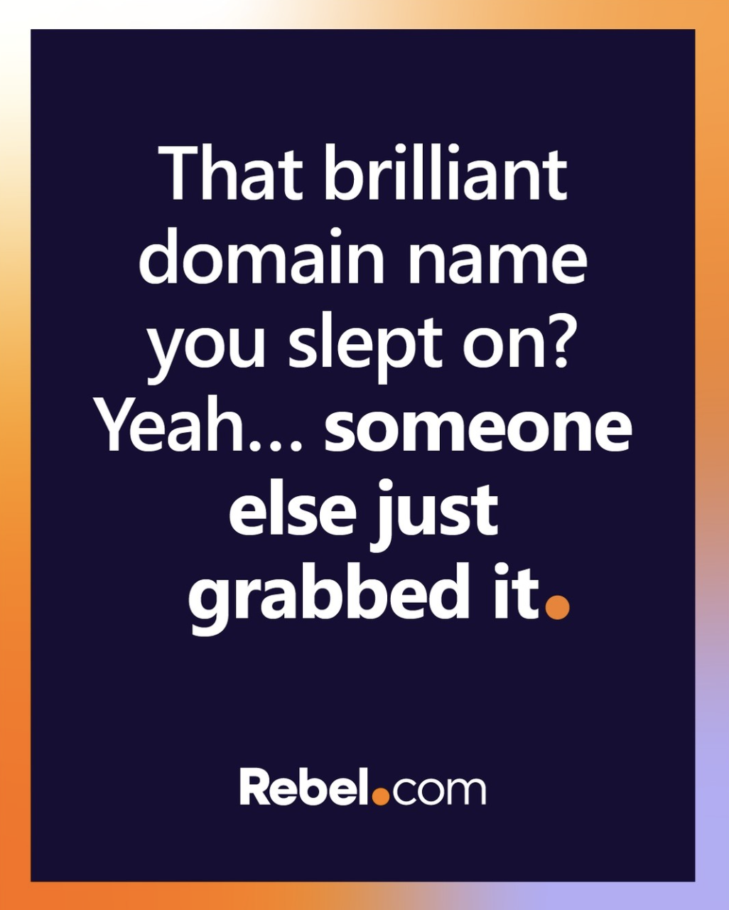
Bringing the idea online.
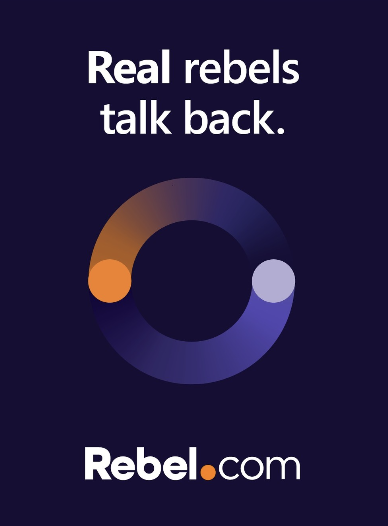
The dot concept translated naturally into digital campaigns because it reflected the moment a customer brings an idea online.
Campaigns explored different interpretations of that moment, from the spark of an idea to the point where a name becomes a real presence on the internet. Across social, web, and paid media, the dot acted as both a visual device and a storytelling tool, punctuating headlines, guiding motion, and marking the moment where an idea becomes a domain. Each campaign reinforced Rebel’s role in helping customers take that step online.

From old to new.